Skip links
This is a collage of images related to Chupa Chups lollipops. On the top left, there is a vintage advertisement featuring the text "The PERFECT Lollipop!!" in bold, stylized lettering, with "Delicious!" written below. The Chupa Chups logo appears next to an illustrated lollipop. Below this, there's another advertisement in Danish, reading "JEG SMAGER DOBBELT SÅ LÆNGE," which translates to "I taste twice as long." It shows a cartoonish, smiling lollipop character and text highlighting ten different flavors. On the right side, there is a black-and-white photo of surrealist artist Salvador Dalí with his iconic mustache, looking directly at the camera. Lastly, the bottom right displays the Chupa Chups logo in its well-known flower shape with the brand name in the center. The colors in the images are a mix of vibrant and grayscale tones.

The surreal tale of the Chupa Chups Logo

Success needs hard work. Don’t listen to these ‘get rich quick’ schemes.

Share

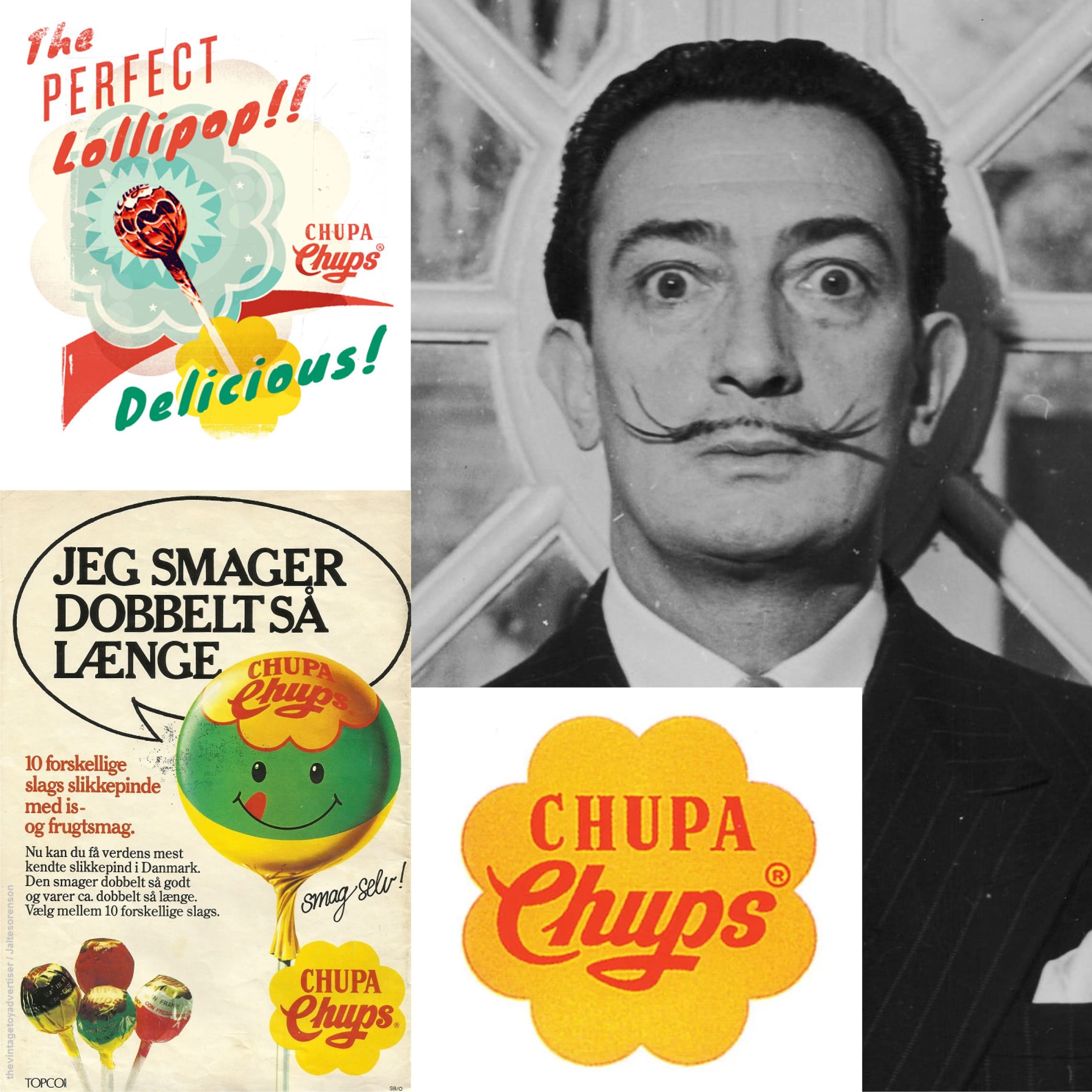
In 1969, the Chupa Chups, a popular name in the world of sweets, was on the lookout for a fresh logo. They wanted something that would stand out, something as fun and inviting as the lollipops they created. So they turned to an unlikely source: Salvador Dalí.

Yes, the Salvador Dalí. The one known for painting those crazy, melted clocks. He wasn’t just about surreal art; he had a knack for branding, too, it seems.

The surreal tale of the Chupa Chups Logo:

Dalí took a look at the Chupa Chups name, scribbled a few ideas, and came up with something quite clever. He drew a bright, bold flower and placed the Chupa Chups name right in the center. It was simple, but it had a twist — he suggested the logo should sit on top of the lollipop wrapper. This way, it would always be visible, no matter how you held it.

The result? A logo that’s as iconic as the candy itself. It’s a splash of sunshine that has stayed pretty much the same since the day Dalí dreamed it up. It goes to show that sometimes, the best solutions come from the most unexpected places.

Chupa Chups and their Dalí-designed logo remind us that creativity can turn something every day, like a sweet treat, into a piece of art. And just like that, a lollipop isn’t just a lollipop — it’s a little bit of history on a stick.

This is a collage of images related to Chupa Chups lollipops. On the top left, there is a vintage advertisement featuring the text "The PERFECT Lollipop!!" in bold, stylized lettering, with "Delicious!" written below. The Chupa Chups logo appears next to an illustrated lollipop. Below this, there's another advertisement in Danish, reading "JEG SMAGER DOBBELT SÅ LÆNGE," which translates to "I taste twice as long." It shows a cartoonish, smiling lollipop character and text highlighting ten different flavors. On the right side, there is a black-and-white photo of surrealist artist Salvador Dalí with his iconic mustache, looking directly at the camera. Lastly, the bottom right displays the Chupa Chups logo in its well-known flower shape with the brand name in the center. The colors in the images are a mix of vibrant and grayscale tones.

View
Drag