Skip links
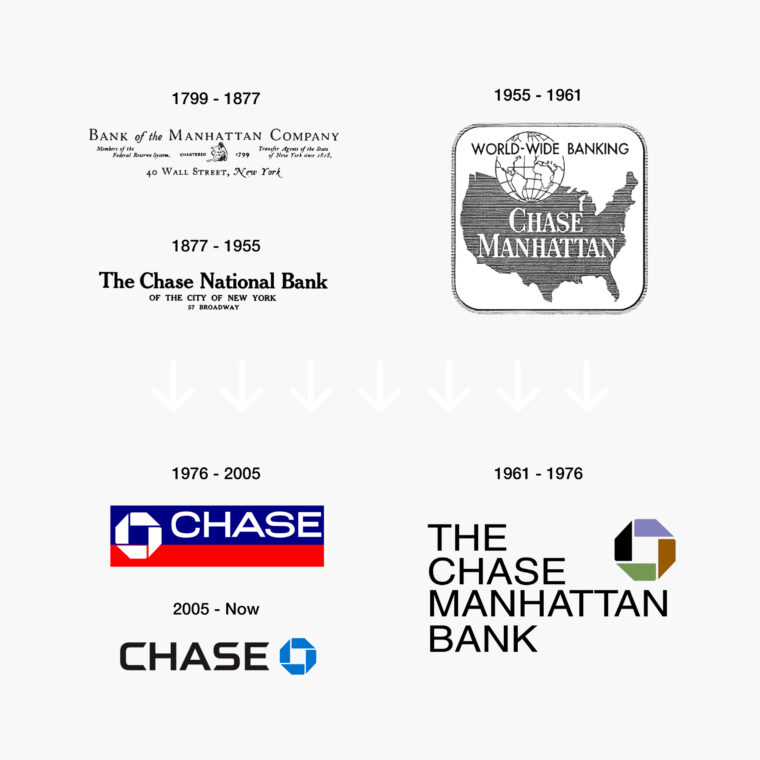
This image displays a chronological arrangement of six logos, each representing the branding of Chase bank over different historical periods, with the dates listed above each logo. In the top left, the period from 1799 to 1877 shows a logo with the text "Bank of the Manhattan Company" in a serif font, along with the address "40 Wall Street, New York". Directly below, for 1877 to 1955, "The Chase National Bank of the City of New York 57 Broadway" is written in a bold serif font. On the top right, the logo for 1955 to 1961 features a shape resembling the United States map with a pattern of lines and the words "WORLD-WIDE BANKING CHASE MANHATTAN". Below it, for 1961 to 1976, "THE CHASE MANHATTAN BANK" is written in bold block letters within a dark square with a colorful right-angled triangle motif. In the bottom left, representing 1976 to 2005, is the familiar Chase logo with a bold "CHASE" over a blue octagon intersecting a red square. Finally, the logo for 2005 to the present is a simplified version of the previous one, with "CHASE" in a sans-serif font next to a blue octagon. These logos represent the evolution of Chase's brand identity over time.

Revolutionizing Corporate Identity

Success needs hard work. Don’t listen to these ‘get rich quick’ schemes.

Share

Revolutionizing Corporate Identity, Logo as a medium for communication vs. a tool for identification

In the financial world of the 1950s, logos were like literal maps – guiding you to understand the company’s purpose and reach. Chase Manhattan’s original logo from 1955 was no exception. It was a tapestry of meaning, with the United States map as its canvas, declaring both its American roots and international presence. But this was about to change.

Chermayeff and Geismar, pioneers in the world of design, saw something others didn’t. They understood that Chase Manhattan wasn’t just another bank; it was a trendsetter, a financial giant whose influence could redefine modern banking. They believed that for a bank of such stature, a conventional logo wouldn’t do. It needed something revolutionary, something that didn’t just communicate but captivated.

Their proposition was radical: an abstract symbol. A symbol that didn’t tell a story but became the story itself. This wasn’t just a logo; it was an icon in the making. Their peers were skeptical. Logos of the time were descriptive, often a direct representation of the company’s business or values. But Chermayeff and Geismar dared to dream differently.

The design they presented was minimal yet profound, a bold departure from the norm. It was more than just a visual element; it was a statement of identity and ambition. They knew the true power of a logo wasn’t in its ability to narrate but in its unique capacity to identify. This concept, now common wisdom, was then a groundbreaking revelation.

Persuading Chase Manhattan to adopt this symbol was a feat of vision and tenacity. It was a testament to the idea that true value in design lies not just in creation but in the courage to challenge norms and envision the future.

This image displays a chronological arrangement of six logos, each representing the branding of Chase bank over different historical periods, with the dates listed above each logo. In the top left, the period from 1799 to 1877 shows a logo with the text "Bank of the Manhattan Company" in a serif font, along with the address "40 Wall Street, New York". Directly below, for 1877 to 1955, "The Chase National Bank of the City of New York 57 Broadway" is written in a bold serif font. On the top right, the logo for 1955 to 1961 features a shape resembling the United States map with a pattern of lines and the words "WORLD-WIDE BANKING CHASE MANHATTAN". Below it, for 1961 to 1976, "THE CHASE MANHATTAN BANK" is written in bold block letters within a dark square with a colorful right-angled triangle motif. In the bottom left, representing 1976 to 2005, is the familiar Chase logo with a bold "CHASE" over a blue octagon intersecting a red square. Finally, the logo for 2005 to the present is a simplified version of the previous one, with "CHASE" in a sans-serif font next to a blue octagon. These logos represent the evolution of Chase's brand identity over time.
This story, like the logo itself, became a legend. It symbolizes the transformative power of vision and the enduring impact of bold, abstract simplicity.
View
Drag