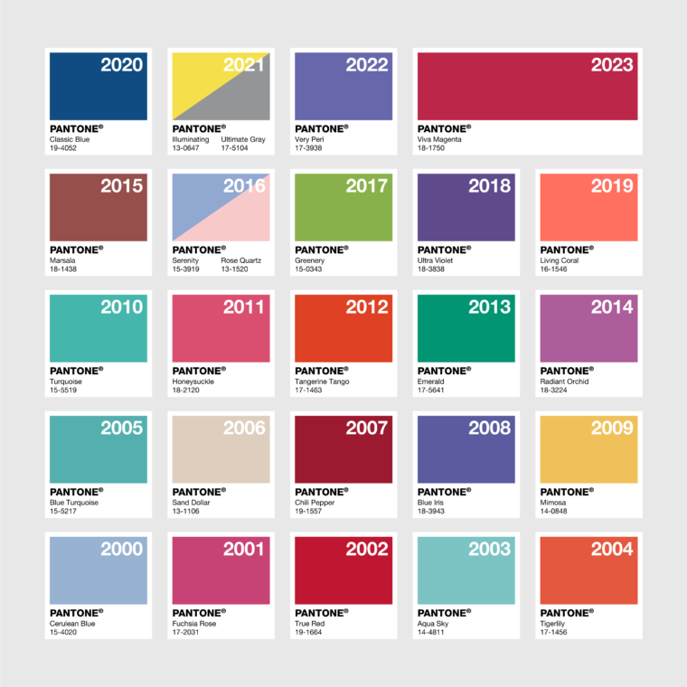
In 1999, a palpable sense of uncertainty about the approaching millennium hung in the air. Pantone’s CEO pondered a significant question: Could they offer a beacon of hope in these uncertain times?
The task fell to Leatrice Eiseman, the company’s color guru. Eiseman believed that color wasn’t just an aesthetic choice; it wielded immense power in shaping consumer behavior and, crucially, bringing joy even in the darkest times. Her mission was clear: to select a color that would not only encapsulate the spirit of the new millennium but also offer a symbol of optimism.
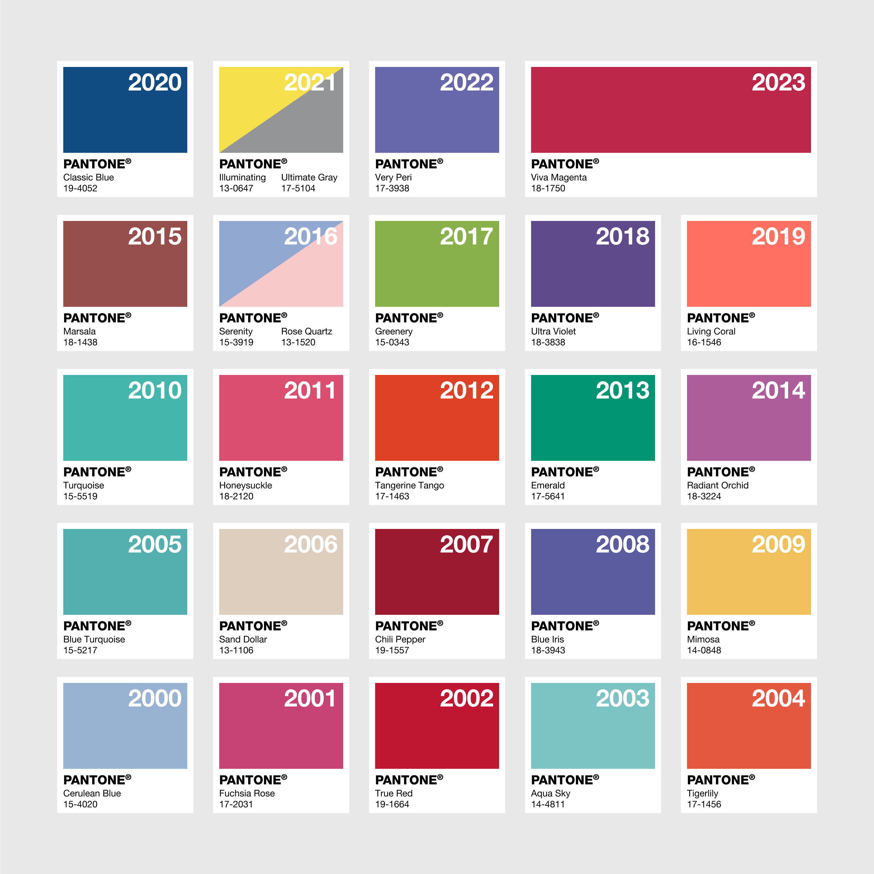
After much deliberation, Eiseman made a choice that would soon become iconic: cerulean, a serene shade of sky blue. “No matter where you live, everyone looks forward to seeing a beautiful blue sky,” she explained. The announcement of Pantone’s Color of the Year was met with unprecedented enthusiasm. Headlines worldwide celebrated the selection, firmly establishing Pantone as the definitive voice in color trends.
The campaign’s success was beyond imagination. Eiseman recalls, “It was like we had a tiger by the tail.” The yearly ritual of selecting the Color of the Year garnered intense interest and catapulted Pantone from a designer’s secret to a household name.
However, Pantone’s journey wasn’t without its challenges. The choice of Living Coral in 2019, for instance, faced backlash. Critics deemed it tone-deaf, especially as coral reefs worldwide suffered significant decay. Designers in Australia even launched a counter-campaign, suggesting ‘Bleached Coral’ as a more responsible choice.
The company also faced criticism for potentially contributing to the waste prevalent in industries like fast fashion. Questions arose about the sustainability of creating products like Emerald bedsheets or Serenity lipstick that might only be popular for a season.
Despite these controversies, the Color of the Year campaign has continued to thrive over the past 25 years. It has been copied, partnered with other brands, styled in various forms, and covered extensively, achieving an undeniable cultural dominance. Pantone, once just a name in the design world, has become synonymous with the essence of color in our everyday lives.
What’s your prediction for this year’s Pantone Color of the Year?