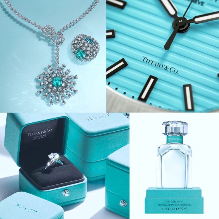
Let’s talk about the color blue. Not just any blue, but a particular shade. A shade that, upon seeing, instantly evokes the image of luxury, elegance, and timeless beauty. Yes, I’m talking about the iconic Tiffany Blue.
In the heart of New York City, in 1837, Charles Lewis Tiffany and John B. Young opened a “stationery and fancy goods” store with an initial investment of $1,000 borrowed from Tiffany’s father. This humble beginning was far from the luxury giant it would become. Yet, even then, there was something different about Tiffany & Co.
In 1845, Tiffany introduced its first Blue Book catalog. And with it, the world was introduced to a shade of blue that would become synonymous with the brand – the Tiffany Blue, also known as robin’s-egg blue or forget-me-not blue. But why this particular shade?
Tiffany chose this blue not out of mere fancy but with strategy. During the Victorian era, the color blue was a symbol of love, fidelity, and purity – precisely the sentiments that align with buying an engagement ring or a timeless piece of jewelry.
Yet, it’s about more than just the color but how it’s used. Every Tiffany purchase comes wrapped in that blue box with a white ribbon. It’s an experience, a promise of luxury even before you see what’s inside. It’s a branding masterstroke. Over the years, this shade of blue became so intertwined with Tiffany & Co. that the color itself is protected as a trademark.
Interesting fact? You won’t find Tiffany Blue in any Pantone book available to the general public. It’s custom. The exact Pantone number is a closely guarded secret, adding even more to its allure.
Much like how Steve Jobs had his signature black turtleneck, Tiffany & Co. has its blue. A blue that’s not just a color but an experience, a memory, a statement. And in the vast spectrum of colors, it stands distinct, shouting elegance, commitment, and timeless luxury. So the next time you see that shade, remember, you’re not just looking at a color but a legacy!


