Skip links

Selected Selected

Projects Projects

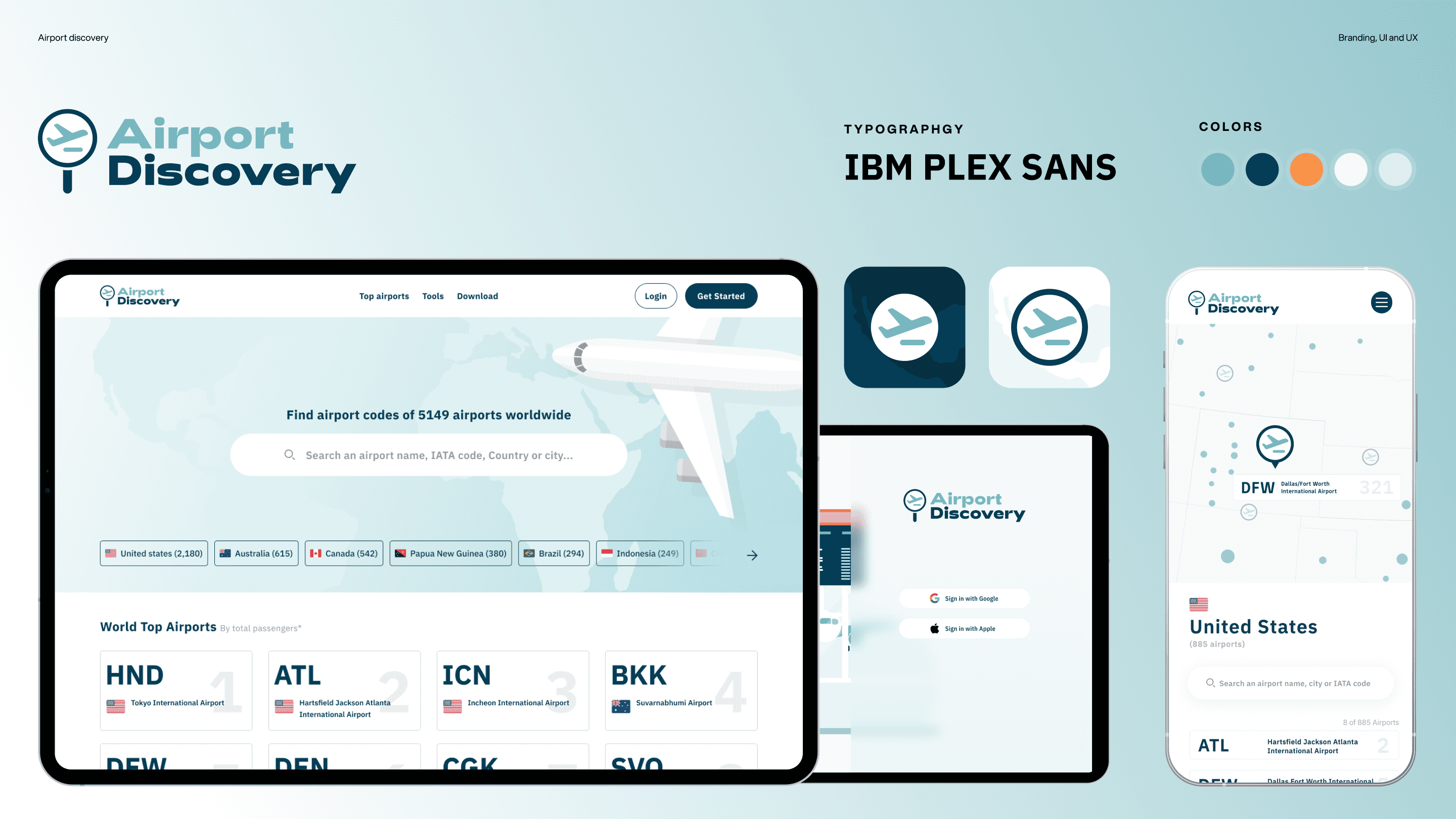
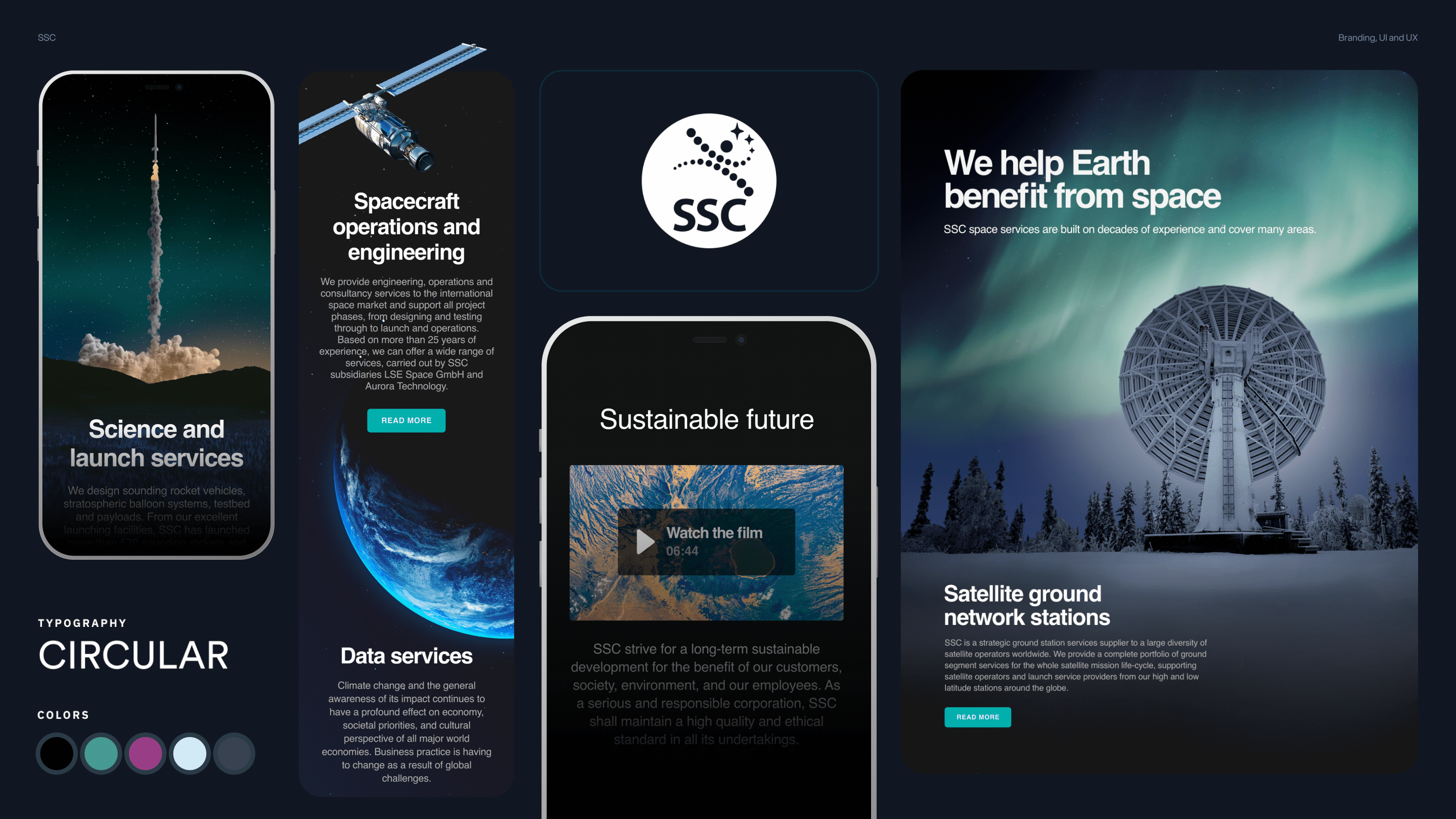
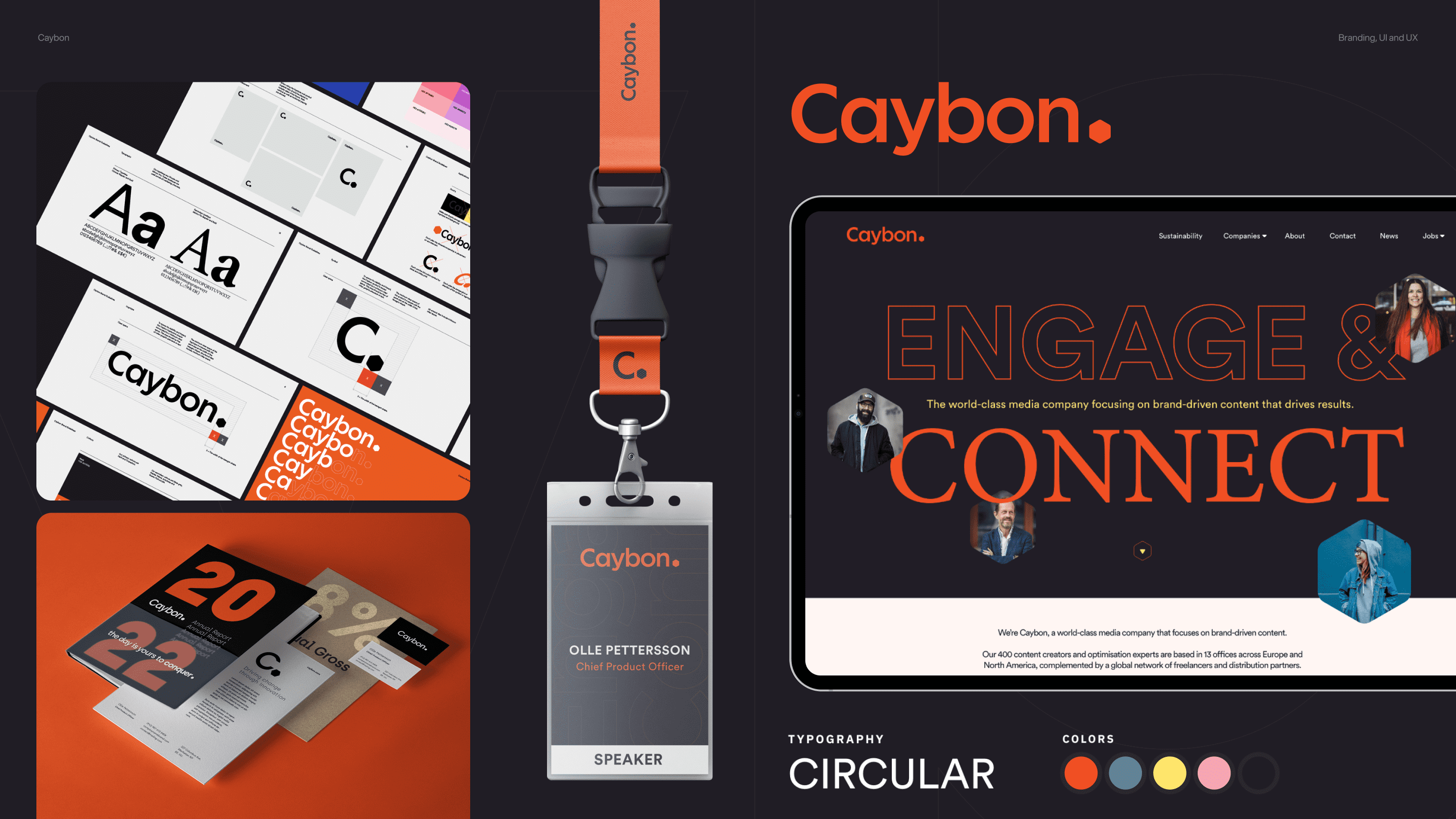
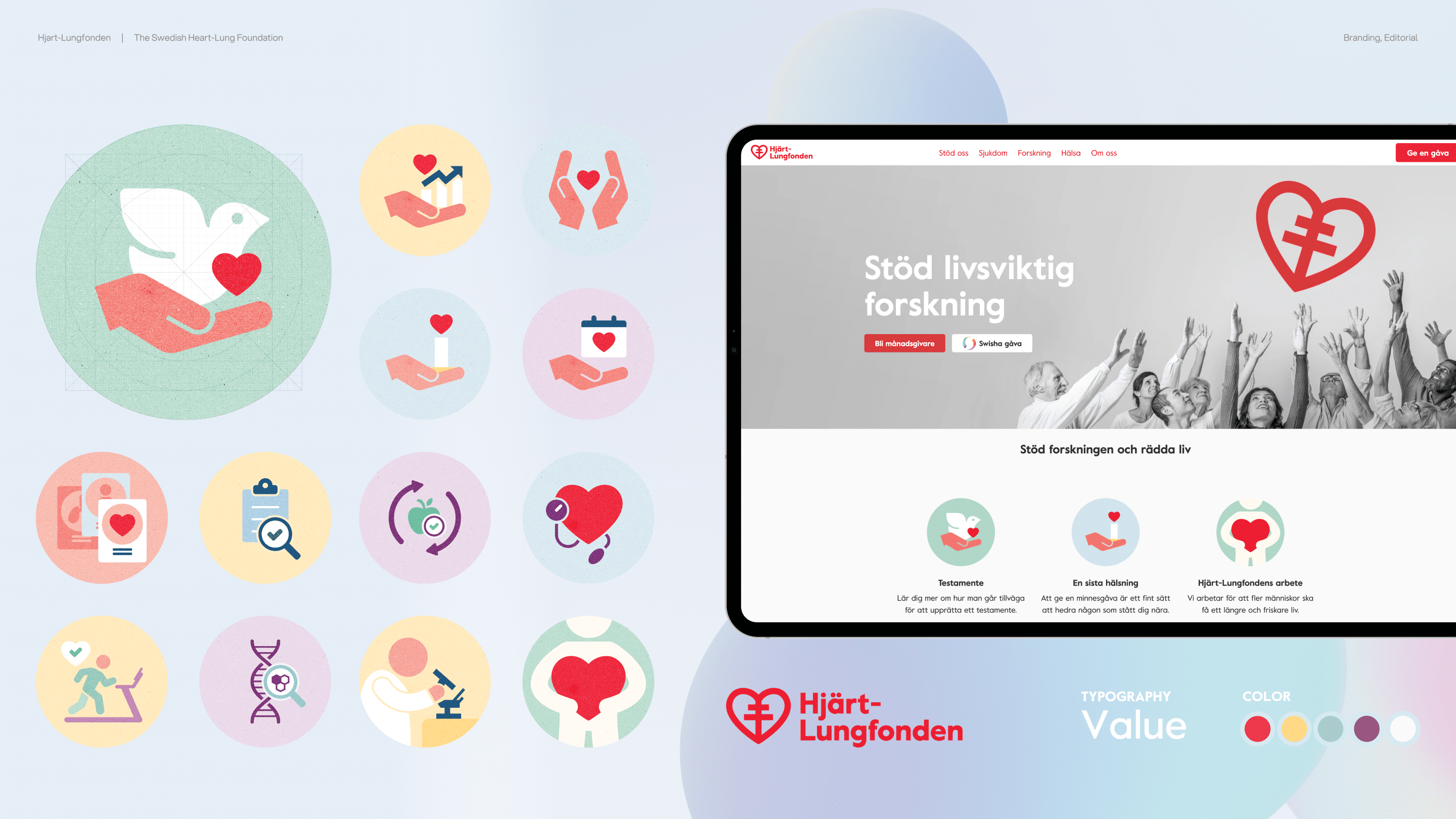
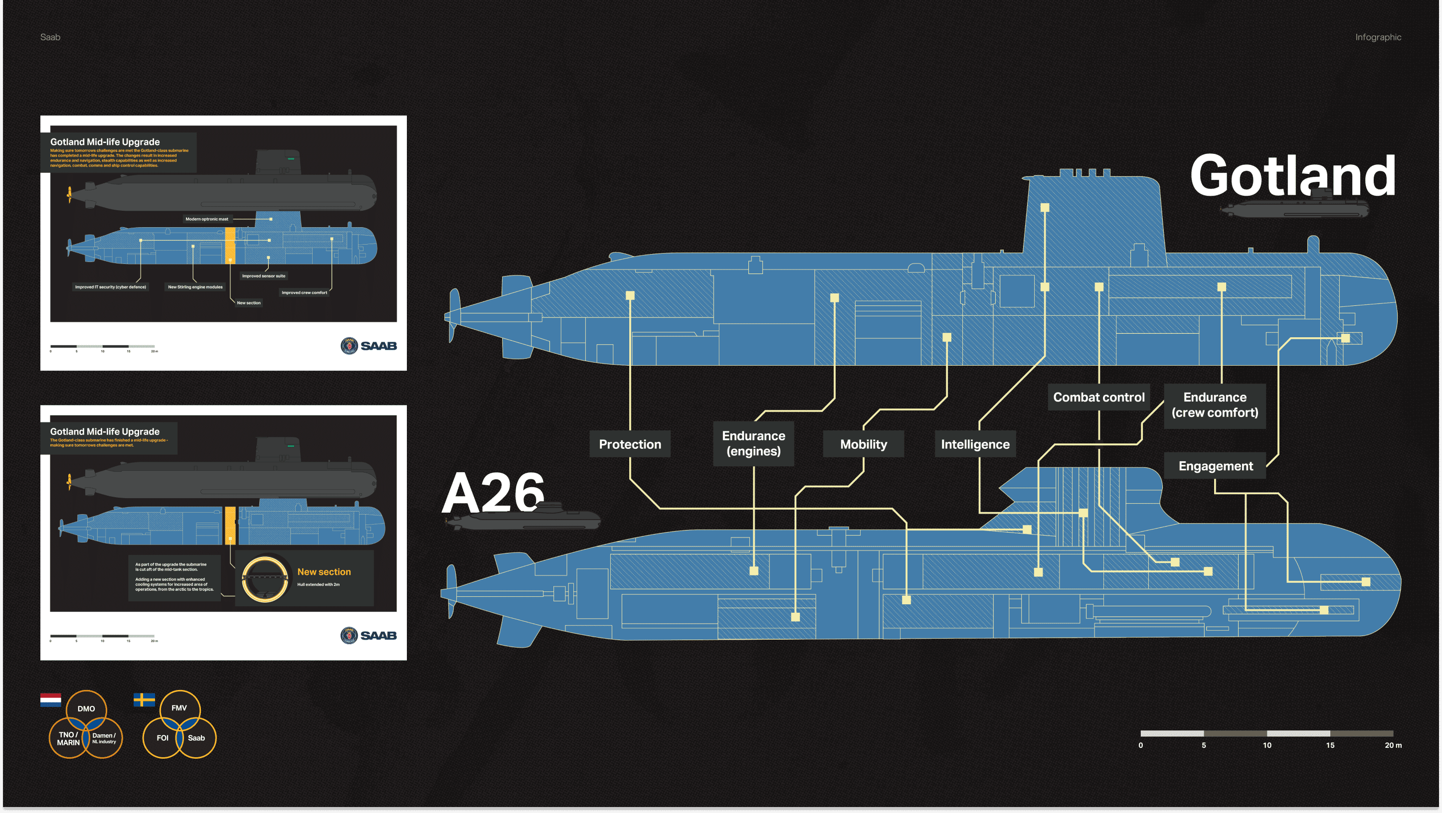
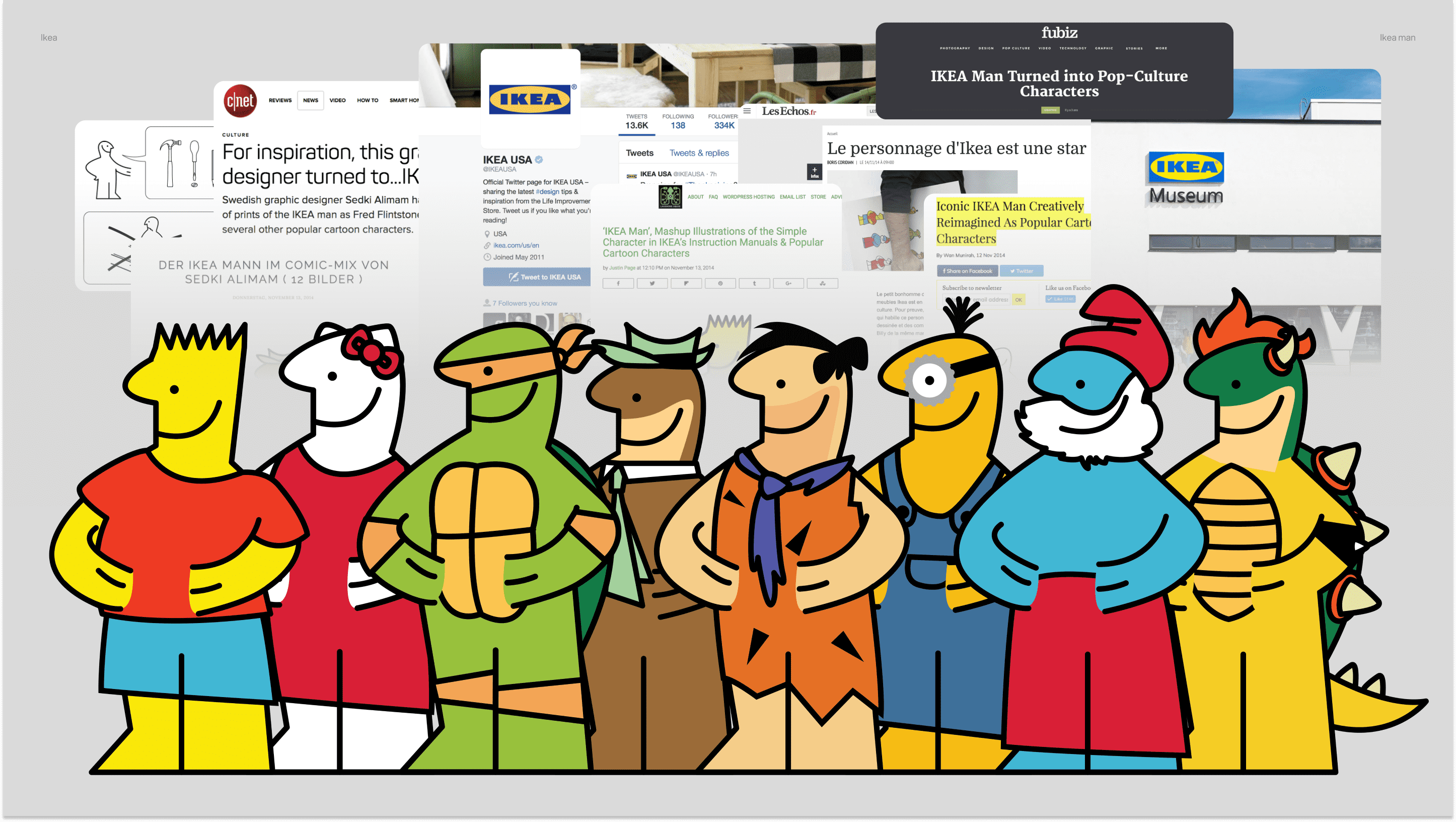
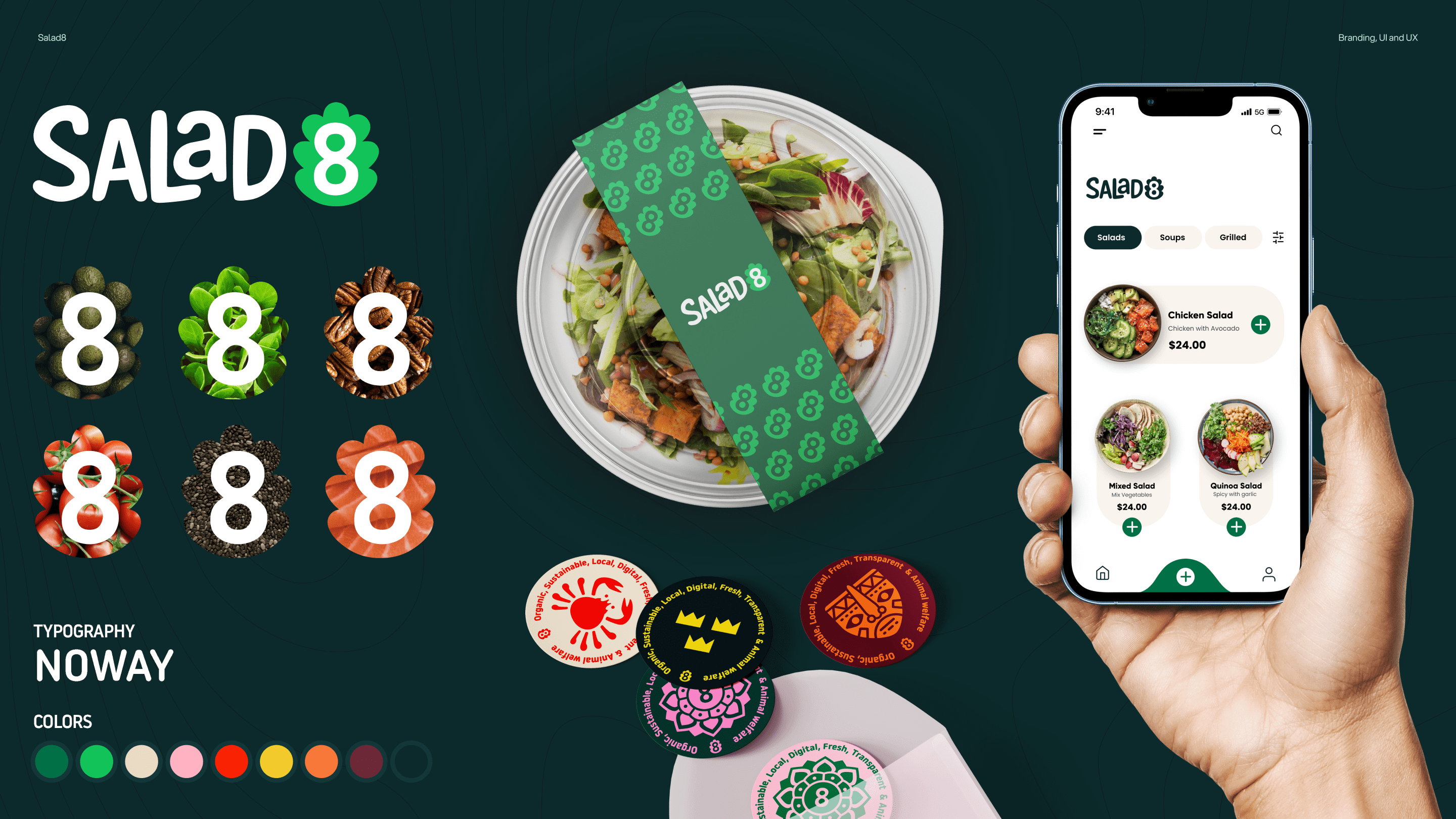
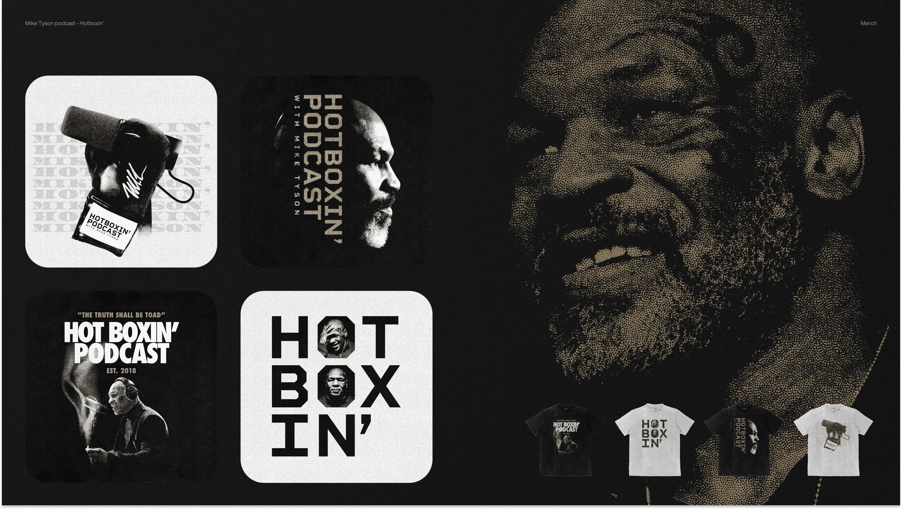
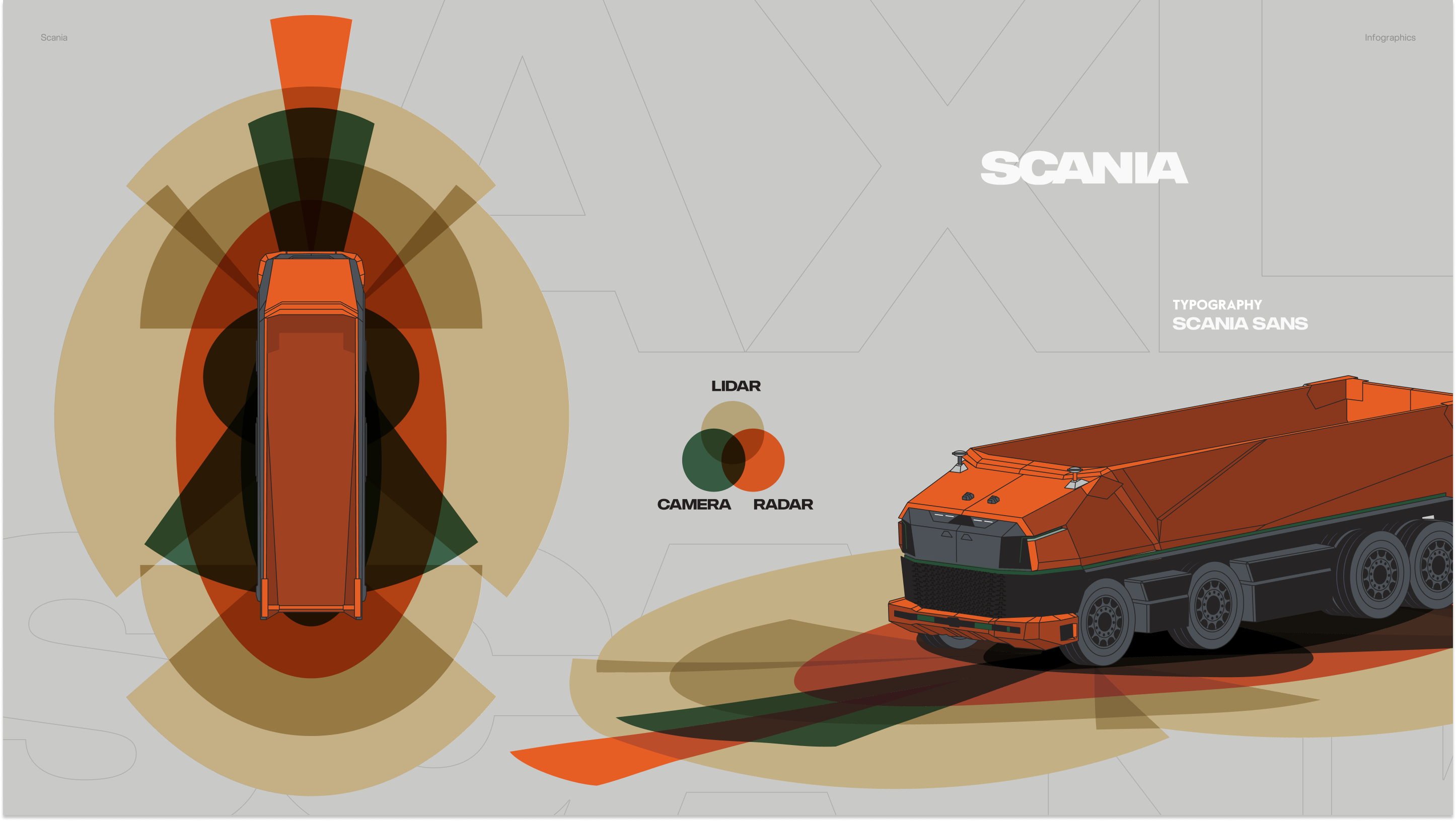
Airport Discovery is a comprehensive digital platform for desktop and mobile that offers unparalleled insight into the world’s airports. Drawing from the most expansive database, the application ranks airports, showcases arrivals and departures, details runway specifications, provides up-to-the-minute weather conditions, and equips users with essential aviation tools. The design ethos is rooted in clarity, intuitiveness, and elegance, reflecting the vast and intricate tapestry of global aviation.

This image is a graphical representation of a brand design for "Airport Discovery", showcasing various elements of the brand's visual identity: On the left, there's a tablet displaying a webpage with a map and a search bar, stating "Find airport codes of 5149 airports worldwide". Below are tabs for different countries with numbers indicating how many airports are listed in each. In the center, the typography used is identified as "IBM PLEX SANS", and the color palette consists of five colors, ranging from dark blue to light blue and orange. The right side features app icons and a mobile phone interface. The app icon has a blue background with a white airplane symbol. The phone screen displays a map with airport locations marked and a detailed information card for Dallas/Fort Worth International Airport, along with a search bar and navigation menu. The overall design is clean, modern, and uses a cohesive color scheme and typography to create a user interface for discovering airport information. The layout is informative and clearly demonstrates the design elements such as branding, UI, and UX that would be used across the digital platforms for "Airport Discovery"

I led the team at Appelberg to refresh the brand for the Swedish Space Corporation. We drew inspiration from the Northern Lights, unique to Sweden and reminiscent of the Esrange Space Center in the north. I co-led the brand strategy, and sprints with Appelberg’s creative director Markus Ljungblom. The collective effort was then showcased in a new website, for which I spearheaded the ideation and foundation. This website later received nominations in major Swedish design contests. Truly, it is a collaborative achievement from start to finish!

Fun fact! Many of the designs I created, including the 50th-anniversary logo for SSC, were printed on rockets that went up to space. How cool is that!

Visit the site
This image presents a visual layout of a brand, presumably called SSC, which seems to focus on space services. The layout is divided into different sections, each with its own text and images: On the left, there is a smartphone displaying a rocket launch with text underneath titled "Science and launch services," explaining that the company designs rocket vehicles and balloon systems. In the middle top, there is a description of "Spacecraft operations and engineering," detailing the company's services in engineering and operations for space missions, mentioning a subsidiary named Aurora Technology. Below that, in the center, another smartphone screen presents a message about "Sustainable future," accompanied by a play button indicating a film to watch. On the right, a text "We help Earth benefit from space" is shown above an image of a satellite ground network station under aurora-lit skies, suggesting their services offer benefits to Earth from space operations. At the bottom, the typography used is identified as "CIRCULAR," and a palette of five colors is displayed, ranging from dark blue to teal and gray. The image as a whole communicates a high-tech, innovative brand image, focusing on space-related services and sustainability, with a sleek and modern design language.
Disclaimer: This project reflects my work at Appelberg and is for portfolio display only. All intellectual property rights belong to Appelberg and its clients.

Caybon is a leading name in digital media, focusing on creating branded content driven by data that delivers real results. With a strong emphasis on understanding and utilizing data. I took the lead in shaping Caybon’s brand strategy and identity, making sure it is clear and memorable. Alongside this, the UI and UX design were carefully crafted to ensure a seamless user experience. This project was about bringing clarity and functionality together in the digital space.

Visit the site
This image is a visual presentation of a brand identity for "Caybon," divided into different sections showing various branding elements: Left side: Features a collection of print and digital design mock-ups, including business cards, letterhead, and mobile interface screens, all branded with the "Caybon" logo and design elements. The materials have a modern look with a mix of black, white, and orange colors. Top right: An orange lanyard with a black security badge holder displaying the "Caybon" logo and a name tag for "Olle Pettersson, Chief Product Officer, Speaker." Bottom right: The website interface on a tablet showcasing a bold headline "ENGAGE & CONNECT" with a subheadline describing Caybon as "The world-class media company focusing on brand-driven content that drives results." Below are images and brief descriptions of the team members or partners. The typography used throughout the branding is "CIRCULAR," and a color palette of five colors is shown, which includes shades of orange, gray, blue, yellow, and red. The overall design conveys a sleek and cohesive brand identity for a company that seems to specialize in media and content creation.
Disclaimer: This project reflects my work at Appelberg and is for portfolio display only. All intellectual property rights belong to Appelberg and its clients.

Hjärt-Lungfonden is a commendable initiative that gathers and allocates funds to elite heart and lung research in Sweden. With a mission so profound, it was essential that their communication tools effectively convey their dedication and purpose. I took the lead in designing Hjärt-Lungfonden’s visual language, focusing on the most prominent assets in their communication: the icon set and their editorial giveaways. These designs were tailored to resonate with the foundation’s objectives, ensuring a clear and impactful message.

Visit the site
The image is a visual representation of the brand identity for the Swedish Heart-Lung Foundation ("Hjärt-Lungfonden"): On the left, a series of circular icons illustrates various health and medical themes, such as a dove with a heart, hands forming a heart shape, and a heart with a stethoscope. These icons represent care, love, and medical attention, which are likely related to the foundation's mission. In the center and right, a tablet displays a webpage for the foundation with a large banner reading "Stöd livsviktig forskning" (Support vital research) and a group of people with their arms raised in the air, some forming heart shapes with their hands. The webpage also includes options for donations and information about the foundation's work, along with the organization's logo which combines a heart and a double helix, symbolizing their focus on heart and lung health and research. At the bottom right, the typography used in the branding is named "Value," and a color palette is displayed, featuring soft shades of red, yellow, purple, and blue. The overall design communicates a sense of hope and community engagement, emphasizing the foundation's commitment to supporting research and health.
Disclaimer: This project reflects my work at Appelberg and is for portfolio display only. All intellectual property rights belong to Appelberg and its clients.

Saab, a leader in defense and security solutions, embarked on a pivotal moment with the introduction of their new A26 submarines and the revamped extensions for their established Gotland class. This series was about conveying intricate technical distinctions with clarity, ensuring that Saab’s innovations were understood and appreciated by the media and public.

Visit the press release
The image is an infographic that presents the technical details and specifications of a submarine named "Gotland." It's likely for the Gotland-class submarines, which are known to be part of the Swedish Navy and have undergone mid-life upgrades. The graphic is divided into several parts: The main part of the image features a large blueprint-style profile illustration of the submarine with labels pointing to different parts of the vessel. These labels include "Protection," "Endurance (engines)," "Mobility," "Intelligence," "Combat control," "Endurance (crew comfort)," and "Engagement," indicating the areas of the submarine that these features pertain to. Above the main illustration are two smaller diagrams showing the submarine's profile before and after the mid-life upgrade, highlighting new sections and improved capabilities. At the bottom, there are symbols indicating different organizations involved, such as DMO (presumably Dutch Materiel Organization), FMV (likely the Swedish Defence Materiel Administration), and Saab, the manufacturer. The top right corner of the image shows the designation "A26," which is a type of submarine developed by Saab for the Swedish Navy. The name "Gotland" is prominently displayed in the top right section, which is the name of the class of submarines to which this particular vessel belongs. This infographic is educational and likely serves to inform about the capabilities and enhancements of the Gotland-class submarines.
Disclaimer: This project reflects my work at Appelberg and is for portfolio display only. All intellectual property rights belong to Appelberg and its clients.

Ikea Man is an illustration project inspired by the iconic character prevalent in their assembly manuals. I playfully re-envisioned him through a series of pop-culture interpretations, which I then showcased on Behance. To my surprise, the project captured the imagination of many and quickly went viral, gaining international attention. This even included acknowledgment from Ikea themselves. This unexpected wave of appreciation propelled my work into art books, renowned magazines, and even led to my participation in the Ikea Hack exhibition at the Ikea Museum in Älmhult.

Visit the full project
The image displays a collection of iconic cartoon characters reimagined as the IKEA instruction manual figure. From left to right, the characters are stylized in a simple, flat graphic form reminiscent of IKEA's instructional illustrations, featuring: Bart Simpson from "The Simpsons" in a red shirt and blue shorts. Hello Kitty in her signature red dress and bow. A Teenage Mutant Ninja Turtle in green with a brown shell and mask. Fred Flintstone from "The Flintstones" in an orange, stone-age outfit. Smurf in white pants and a red hat. Homer Simpson from "The Simpsons" in a white shirt and blue pants. A Minion from "Despicable Me" in blue overalls. The background includes web browser windows with articles related to the "IKEA Man" turned into pop-culture characters, suggesting this is a creative project or a design concept.

Salad8 emerges as a premium salad bar concept, distinguishing itself by weaving together the rich tapestries of diverse cultures through its offerings. At its core, the brand is committed to eco-friendly and organic ingredients, allowing customers to experience fresh, wholesome choices. I developed the branding that resonates with Salad8’s high-end and culturally inclusive identity. Complementing this, I designed a mobile app that offers users an intuitive platform to customize their salads, aligning with the brand’s promise of quality and sustainability.

The image is a visual presentation of a salad-themed brand identity for "SALAD 8": On the left, there's a collage of the number "8" depicted with various salad ingredients like greens, nuts, and tomatoes, reflecting the brand's focus on salads. In the center, a clear plastic salad container with a green branded sticker is presented, showing a fresh salad mix inside. On the right, a hand is holding a smartphone with an open app for "SALAD 8", displaying a menu with salad options and prices, suggesting it's an online ordering platform. At the bottom left, the typography named "NOWAY" is indicated, along with a color palette of eight colors ranging from green to red and brown, likely representing different salad ingredients or themes. The overall image conveys a modern, digital-first approach to salad sales, with a focus on freshness and variety.

I was approached to bring that signature flair to Mike Tyson’s own podcast ‘Hot Box In’ merchandise line. The result was a series of products that not only resonated with the podcast’s dedicated audience but also showcased the design aesthetic I’m known for. This collaboration was about intertwining the raw and authentic voice of ‘Hotboxin’ with a visually compelling style, creating merchandise that stands out in the market.”

Visit the online store
This image appears to be a promotional collage for the "Hotboxin' Podcast" with Mike Tyson, established in 2018. The collage is set against a black background and includes various elements: Top left: A white square with repeated text "HOTBOXIN" in the background and an image of a black boxing glove with the Nike logo, along with a tag labeled "HOTBOXIN PODCAST". Top middle: A black square featuring a high-contrast, half-tone portrait of Mike Tyson facing to the right against a dark background. Top right: A larger area with a detailed, grainy, high-contrast halftone image of Mike Tyson's face, looking directly towards the viewer, labeled "Merch". Bottom left: A white square with the text "THE TRUTH SHALL BE TOAD" above "HOT BOXIN' PODCAST EST. 2018", with an image of Mike Tyson wearing headphones, likely in a podcasting setting. Bottom middle: The words "HOT BOXIN'" in large, bold white letters on a black background. Bottom right: Three t-shirts with different designs, all featuring elements of the podcast branding, such as the name and images of Mike Tyson. The overall design is gritty and monochromatic, with a focus on branding for the podcast. The use of black and white enhances the tough, raw aesthetic associated with boxing and the persona of Mike Tyson.

DigitalRoute helps many Fortune Global 500 enterprises simplify and accelerate their transition to anything-as-a-service and subscription businesses by enabling them to accurately and reliably manage their usage data and augment their revenue streams.
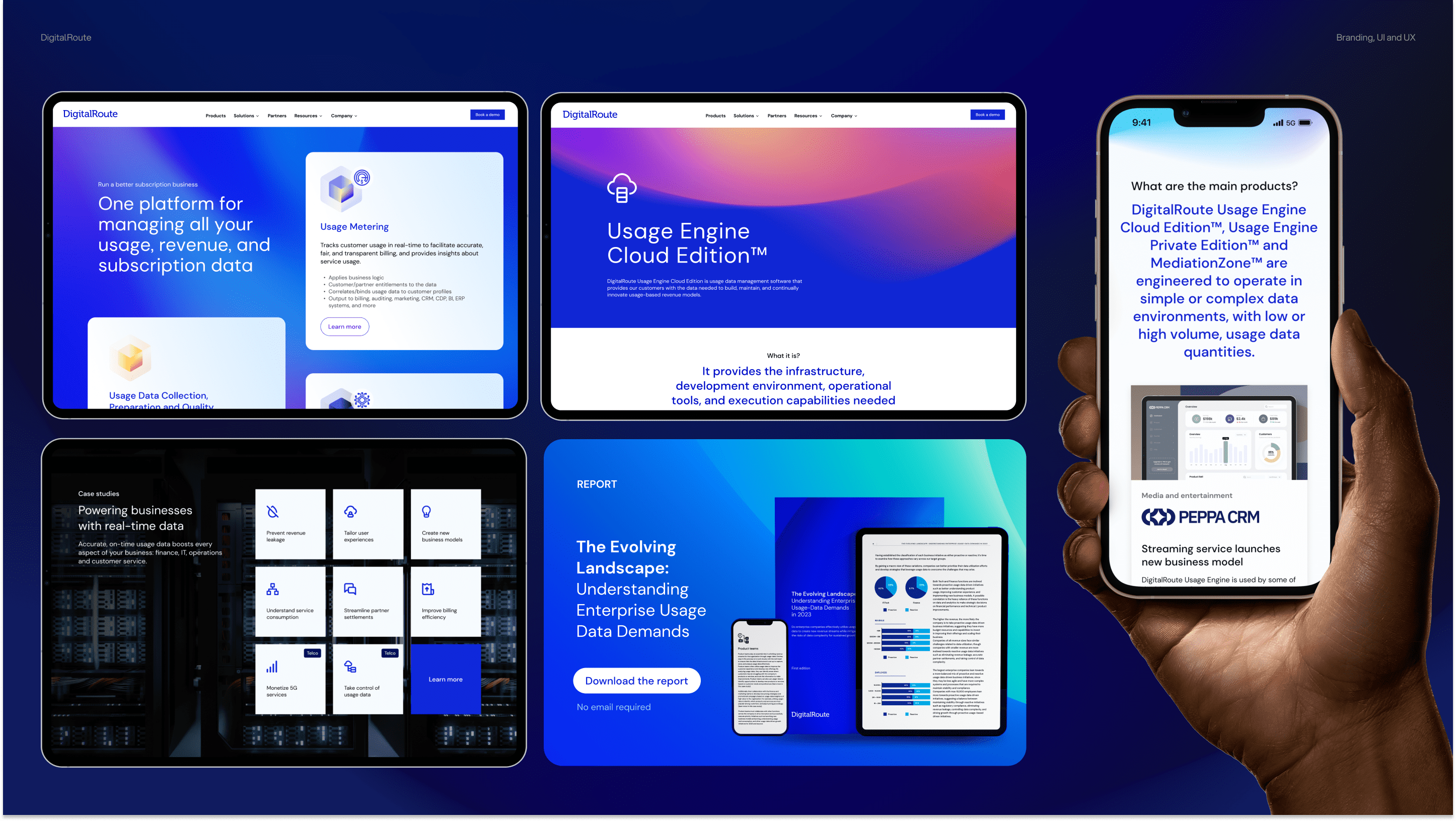
As a member of the leadership marketing team, I am responsible for developing and implementing the brand strategy for DigitalRoute. 
My responsibilities include defining our brand vision and values, overseeing the creation of the brand identity, content and messaging.

Visit the site
Disclaimer: This project reflects my work at DigitalRoute and is for portfolio display only. All intellectual property rights belong to DigitalRoute.

Scania, a global leader in transport solutions, introduced its groundbreaking Autonomous Mining Truck AXL, equipped with state-of-the-art radar, lidar, and camera systems. To effectively communicate the seamless synergy of these technologies and their functionalities, I was asked by Appelberg to lead and design a series of infographics. Drawing upon my expertise, I crafted visuals that simplify and elucidate how these intricate systems collaboratively operate, ensuring a clear understanding for the intended audience. This project was about translating complex technicalities into engaging and comprehensible visuals, amplifying Scania’s innovation in the autonomous driving landscape.

Visit the press release
The image is an infographic featuring an orange Scania truck from a side and top-down perspective, showcasing the vehicle's sensor technology. Concentric circles and shapes in shades of orange, green, and brown illustrate the coverage areas of different sensors. Labeled diagrams indicate the locations of LIDAR, CAMERA, and RADAR technologies, with overlapping areas shown in a Venn diagram arrangement on the left side of the image. The right side prominently displays the word "SCANIA" in large, white, capitalized letters with a subheading "TYPOGRAPHY SCANIA SANS" below it. The truck is detailed, with a focus on its sensor equipment and streamlined design. The background is a muted grey with abstract geometric shapes, and the overall layout is clean and modern.
Disclaimer: This project reflects my work at Appelberg and is for portfolio display only. All intellectual property rights belong to Appelberg and its clients.

Discover More on Behance

Behance is my sandbox, where my personal projects and experiments come to life. These projects have brought me immense joy and gained some recognition within the design community. Take a peek at this playful parade!
Go to Behance

View
Drag